

Firelens Ar
FireLens AR is designed to improve the training practices of firefighters, specifically by accurately simulating the intensity of victim structure rescues. By implementing augmented reality, FireLens will give the user the ability to train for a wide variety of high-hazard, low-frequency emergencies that would otherwise be nearly impossible to train for. Currently, the only viable method for training is “burn buildings”, where the instructor intentionally ignites a structure, resulting in a giant cloud of black smoke and an entire building disintegrated. These repercussions, most notably the cost and damage to the environment, are driving a push towards finding an alternative training method.
This technology would be implemented using goggles to allow a firefighter to navigate through different scenarios with varying risks, structure materials, structure ages, causes of fire and victim numbers. No two scenarios will be identical, significantly increasing the users readiness for real emergency calls. FireLens improves quality and quantity of training, thereby keeping both firefighters and the environment safe.
The Research
Q. 01
In cases of low-frequency, high-hazard events, together with other factors: what are training gaps that you see that have contributed to in the line of duty death? What steps have you already taken to close those gaps?
Q. 02
What is a typical training day like for you? How often do you train? Do you have specific training for different scenarios? What parts of training are currently only possible on-the-job?
Q. 03
What kind of problems do you run into when preparing for emergency situations? How accurately does your training simulate an emergency situation?
q. 04
What steps do you take in the fire station before you leave to mitigate on field emergency? How often do you come in contact with an emergency similar to your training?
Findings from our Research
After visiting local fire stations and speaking with many active firefighters, the two people below identified problems we chose to address.
Jason
Firefighter training can include vehicle fire extractions, medical training, helicopter training, victim rescue, and hose testing. Some low-frequency, high-hazard emergencies are hard to train for. Digital simulations provide some training, but they provide limited scenarios so many situations have to be learned on the job.
Trevor
Firefighters in training have a task book with over 230 protocols that are required to be memorized. While learning the subject matter, trainees give presentations on the material to the others which both reinforces learning and refreshed the memories of the firefighters.
Persona
Gabriel “Gabe” Neilson

Photo by Kevin Sicher on Unsplash
ABOUT
Age: 32
Located: San Luis Obispo, CA
Rank: Lieutenant
Family: Wife & two kids
Bio
Gabe is a 32-year-old firefighter at San Luis Obispo’s Fire Station #2. Due to his recent promotion to Lieutenant, he is now responsible for supervising daily operations and spearheading training. He wants to modernize training to improve firefighter health and safety. However, many low-frequency, high-hazard situations are too difficult to learn on the job and there are limited alternatives for training.
Quote
“Training for low-frequency, high-hazard situations is hard because those events don’t happen often enough to learn on the job. Now that we can’t burn demo houses, we need to find a way to train for modern house fires.”
Goals
Increase firefighter health and safety
Training for low-frequency, high-hazard situations
Adapting to fires of modern homes
Training without exhausting finite resources
Train while minimizing environmental impact
Interactive Framework

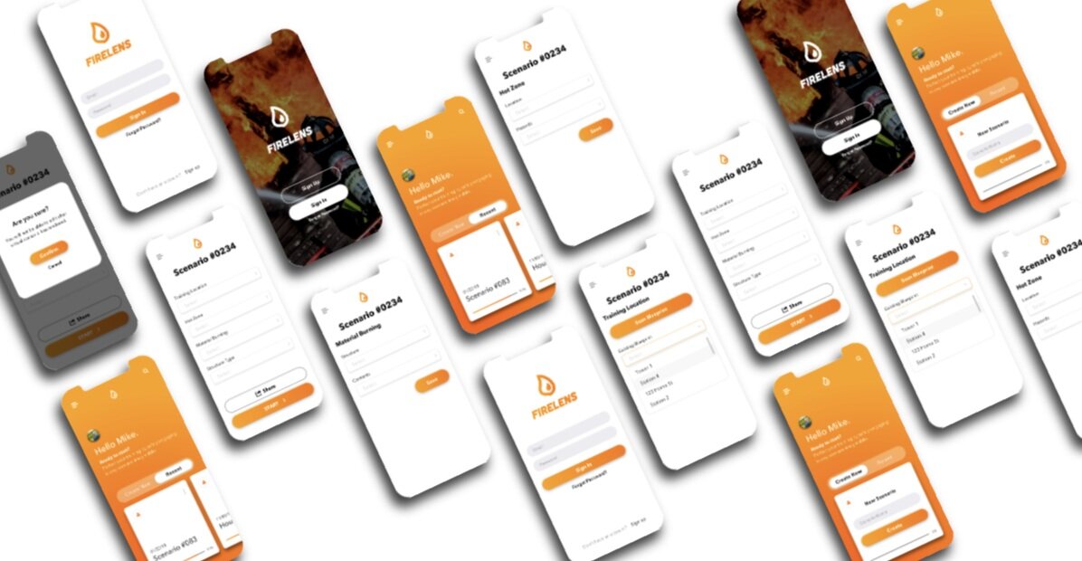
Home Screen
The page above labeled “Home”, will greet the user after they have logged in and present them with the option to complete an assigned task or use a scenario they have created in the past, regardless of completion status. Each user will be given a profile so they can easily track their progress, train at their own speed and pick up were they left off each day. When the user is deciding between creating a new scenario and resuming a recent one, they will be able to view information such as their progress, date last modified, challenges and more.
Scenario Screens
If the user decides to select “Create New,” they will be presented with the ability to choose between sets of conditions that are common in high-hazard, low-frequency emergencies. If they choose to use a scenario that is already in progress, under “Recent", they have the option to resume where the left off in their last session or restart.
Condition Settings
The condition settings is where the user can manipulate the scenario by adjusting elements of a fire scene such as materials, construction year, ventilation, and fire type. These options are presented under four main categories; training location, hot zones, materials burning and structure type. More elements that will be taken into consideration classified under “Structure” will include the duration, collapse risk, cause of fire, and temperature.
Usability Analysis

Usability Tests
This user flow diagram demonstrates the functionality path for the app that would allow firefighters to set up training scenarios for victim rescue and strategy for extinguishing different types of structure fires. Each scenario is customizable to allow the training officer to create a variety of circumstances and provide a diversity of training situations. While creating a new scenario, the user can choose the following elements to customize: the layout/floor plans, building material, location, number of victims in the building, and the cause of the fire.
Task 01
Create a new scenario. We asked the user to create and customize a scenario. This task entails defining the scenario by choosing a structure, building material, ventilation, victims in the building, and cause of the fire.
Task 02
View a past scenario. We asked the user to review a previously executed scenario. This task entails reviewing the list of previous scenarios and examining the corresponding data.
Task 03
View a simulation. We asked the user to watch an ongoing simulation. This task entails opening and watching a scenario as it is being executed by trainees.
Usability Analysis TEst Results
What We learned
We tested our wireframe on three firefighters. First, they told us about SimsUShare, software which allows users training for emergencies to upload photos and insert simulated emergencies. Then, they told us about HaptX, which is developing VR for a variety of training, including pump operation for firefighters.
While clicking through the wireframe, the firefighters provided more feedback on the content than the layout or functionality of the wireframe. They told us that some of the customizable elements we included in our wireframe don’t make enough of a difference in fighting fires to be worth including in training.
One firefighter recommended focusing on the location of the fire (kitchen, bedroom, etc.) and what’s burning (natural gas, contents of the structure vs. the structure itself). Another firefighter suggested that knowing the structure type helps set expectations when arriving on scene, so an option to choose single family residential, multi family residential or commercial would be helpful.
Furthermore, in addition to information about the fire being dispatched while firefighters arrive on scene, a 360° or walk-around is performed to assess how to fight the fire. The firefighters didn’t comment much on the user interface, but were visibly struggling to toggle between pages and getting frustrated when asked to find previous scenarios. To fix this issue, we increased the size of our back button, and made the layout more intuitive by updating the wireframe’s content based on their feedback.
How we adapted the product
To address the difficulty in pressing back buttons, instead of having just the words next to the arrows link back, we added an invisible box around both the arrow and its label to increase the area of the back buttons.
The firefighters heavily critiqued the content of the wireframes, so we made changes according to all of their feedback.
We updated the sections of the scenario building that are customizable to match what the firefighters expressed was the most important. We got rid of the “Material,” “Ventilation,” “Victims,” and “Cause of Fire” pages and instead created new pages for “Location of Fire,” “Material Burning,” and “Structure Type.”
The “Location of Fire” page allows the user to customize where in the structure the fire is happening. The “Material Burning” page allows the user to customize whether the fire is burning the structure itself, just the contents of the structure, natural gas, etc. Finally, the “Structure Type” page allows the user to choose whether the structure is a Single Family Residence, Multi-family residence, or Commercial structure.
Additionally, we realized throughout testing that we needed to show an example of what a user could view when revisiting past scenarios. We created the “Scenario 11/23/2019” page and incorporated a “360°” section which would include information gleaned from performing a walk-around.
User Interface design
Annotated Layouts
We modeled the general aesthetic of our high-definition layouts after other firefighter apps by using a fairly neutral color palette with red to add a pop of color. We chose the red color that is strongly associated with firefighters and firetrucks. Beyond the red and neutral color palette, we wanted the design to be simple in order to maximize functionality and legibility.
The buttons were made round and fairly large to increase the target size to make them easier to select and for consistency all action buttons were rounded. Additionally, the dark grey color is used to draw the user’s attention for actions. For example, “Create New” is dark to attract the user, and “Kitchen” is the same color to show the users that they performed a task by selecting that option. All icons used were the standard iOS icons to increase consistency and usability.
We chose the Airbnb Cereal typeface because it’s rounded but sharp, so it fits the visual language of the app and enhances legibility. The weight of the type was chosen to ensure that all text would be easily readable and legible, and complement the tasks the user needs to complete without distracting the user.

Final Product design

Design Principle Analysis
Here is a sample set of the design principles I considered:
Mental Model
A common mental model for mobile application includes a small gear to represent the settings page and a small house button to go to the home page, as well as navigation bars that are accessible throughout the interface. To adhere to a new user’s mental model of mobile applications, we included those standard home and settings buttons in a navigation bar located at the bottom of nearly every screen.
Wayfinding
To improve navigation through our mobile application, we included a title at the top of every screen to help a user assess their current location within the app, buttons are clearly labeled to help a user determine their route, and a navigation bar is almost always at the bottom of the screen to help a user return home at any time.
Hick’s law
We limited the number of options provided on the home, settings and scenario pages to decrease the time a user needs to make a decision and complete the training. This helps direct the users attention and encourages them to proceed in setting up their training session.
Chunking
To improve the user’s ability to comprehend the information on each page, we grouped the information into various sections. There are separate pages for the user to create a new scenario versus viewing past scenarios. While creating a new scenario, the four areas of customization each get their own page: Training location, fire location, material burning, and structure type. When viewing the past scenarios, the user only views data for one scenario at a time and the data is divided into sections.
Fitts’s law
We made the size of our targets as large as possible to improve usability. For example, we made interactive buttons like the back buttons larger. We also made the start button fairly large and close to the other buttons so that it would be easy to click once settings are finalized.
Visibility
By optimizing and refining the content placed on each page we can lead the user though the process and guide them through a series of steps. We only included the necessary information on the landing and home page to make the app accessible and easy to navigate.
Signal-to-noise ratio
In order to optimize the signal-to-noise ratio, we included very little to no extraneous information anywhere within our app, and users looking for more information can look for it when they want it rather than be bombarded with information they don’t need.
expectation effect
In order to prevent any expectation effects from biasing the results of our usability testing, we made sure to use neutral language to describe our app as simple as possible to allow the firefighters to form their own opinions.
Affordance
In order to improve the usability of the interface, we designed our buttons to afford clicking but giving some of the buttons some dimension to emulate physical buttons. Additionally, our home button is a house icon, and the button for adding options is the symbol for addition, or “plus” sign.