Charles Schwab Redesign
Overview
Charles Schwab has always been one of the biggest brokerage firms in the US, but in recent years many investment apps have begun to enter the market.
I conducted a case study to understand general investing experience with the goal of enhancing the usability of the Charles Schwab app.
I wanted to deep dive into finance apps and consider how the design can affect the usability, portfolio management, and trading behavior. Through research, I was able to identify pain points that users were experiencing like being able to accurately understand account balances and remembering IRA contribution amount. After conducting interviews and secondary research, I was able to get a better understanding of the users’ thoughts and feelings. I then designed prototypes and validated them with user testing.
Goal
To redesign the Charles Schwab app, creating one central portal to manage all finances including savings, real estate, credit cards, and investments in stock, bonds, crypto and other options.
The redesign should help drive engagement in the app and promote in-house accounts first followed by external accounts. I want to drive an increase in new assets under management in Charles Schwab.
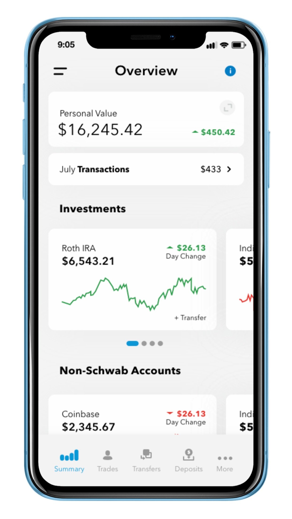
Overview redesigned to enable users to view personal value, manage accounts and pay credit card balances all from the home page. View annotated layout for details.
Personal Value accommodates each user’s unique portfolio and has the main purpose to inform them of asset allocation. View annotated layout for details.
The Problem
Investing is notoriously confusing, frustrating and time consuming. A number of factors, such as loss aversion, confirmation bias, and mass conformity, are some of the main barriers individual investors face when entering a position in the stock market. For someone new to investing, the additional steps during the signup process and researching what tradable securities to invest in might be a battle of its own. While many of these problems are traced back to psychological hurdles, the user experience can play a huge role in how users choose to invest their money.
Target Audience
I learned the current demographic of Charles Schwab users is skewed towards people over 50 with an average of $240,000 in their account. I wanted to keep this in mind to avoid alienating the current users, but focus on attracting a larger, younger crowd. I believe as the population ages Schwab will need to pivot to cater to the next generation of investors to stay relevant.
Research
Competitive analysis
Takeaway:
New investing apps like Robinhood have provided many opportunities for new investors to enter the market with a frictionless user experience, but it has also made many question their intentions. The popularity has grown among Gen Z and Millennials because of its design, convincing many users it is simple and easy to invest. Enabling users to sign up and trade within minutes, Robinhood has removed many barriers of entry for people that wanted to enter that stock market. The app resembles something designed in silicon valley, not from wall street, which gamifies the idea of investing.
On the other hand, Charles Schwab is more geared toward experienced investors who require many tools and research for complex decision making. Generally used by an experienced, older investor, one of the drawbacks of using Charles Schwab or other traditional investment platforms is the complex interface.
On the homepage of the Charles Schwab app, it is not possible to learn about a company and make a trade. After conducting market research, the users are required to move from their current task within the product, navigate to the trade tab, and begin a new task of following a list of instructions in order to make a trade.
User Interviews
Participant Demographics: 5 Participants, ranging from 23 - 65 years of age.
Goal: To understand how users interact with their investments. To learn how frequent they trade, the amount they trade and knowledge behind each trade.
Outcome:
1 - Multiple accounts
Hold accounts with many companies (crypto, real estate, savings, investments)
2 - Age contributes to risk in investment portfolio
The younger users were, the more they traded and the more risk they took on
3 - Decisions were influenced by design
Wanted to feel like they made an informed decision that aligns with their asset allocation goals
4 - Need to work towards a goal
I learned people with concrete goals tend to invested more
5 - Location effects how the app is used
Bigger trades are generally made on a desktop so they can use all the tools effectively. Location, device and age play a role in how they interact with Charles Schwab
Personas
Eliott Gordon, 21 - HS Graduate
Income: $900/month
Eliott is a third-year college student, enrolled in a four-year university. He works at the front desk of his dorm to receive free rent and an additional $900/month. Eliott recently created an account with Charles Schwab and downloaded the app to invest money from his part time job. He enjoys staying updated on the top-performing stocks and often buys popular ones, despite the quality or contribution to his overall portfolio diversity.
He needs to be able to quickly see the performance of his accounts and compare them to know if he should take action by buying or selling more stocks.
Katelyn Murphy, 27 - Bachelor’s Degree
Income: $9,500/month
Katelyn is working at her second company in five years and quickly moving up the career ladder. She has had an account from a young age where her parents taught her tips of the stock market and how to safely invest for retirement. She has ambitions of retiring by the age of 50 years. After all her bills are paid, her income is automatically invested into the stock market in multiple different accounts, including IRA, 401k, and individual.
She needs to stay updated on IRA contribution progress and other goals she has set for herself to retire.
Edna Doyle, 67 - HS Graduate
Income: $1,500/month
Edna has retired 6 years ago and lives off of her IRA and social security. She wants to make sure her portfolio is allocated in a safe option because she recognized the importance of lowering her risk in the market at this age.
She needs to be able to view her overall net worth to ensure she can afford a trip to Europe that has been on her bucket list since she was a child.
Key Quotes from Users
“I can trade in just a few clicks on Robinhood”
“I spend tons of time researching stocks to balance my portfolio”
“Last time I tried to see how much I contributed to my IRA, I had to call the support line”
Annotated Layouts
Overview Landing Page
Signal-to-Noise Ratio - I reorganized the content and made a few key changes to reduce friction on the home page. The process of viewing the user’s personal value and making a trade has been simplified by placing it center, reducing noise to improve the usability.
Navigation - I updated the tab bar to include transfer and deposits by default because my research uncovered these as the most common user actions. Ideally, the happy path use case will have the fewest number of clicks.
I chose to keep the account titles visible with the amount in each account, similar to the current Schwab design. I converted the account list to rotating boxes that encompass a graphical display of the performance of each account so the user can easily compare performance across accounts with a simple swipe.
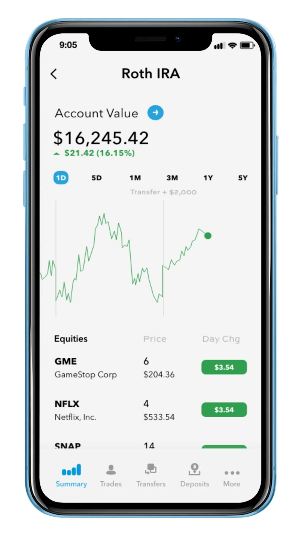
Transfers - Users complained that transferring money creates a false “red day or green day” that does not correlate with investment performance. For example, contributing to an IRA can cause the users account to increase by 10% in a single day, which is obvious on that day but hard to remember 18 months from now. I solved this issue by clearly annotating graphs to indicate transfers when a user taps.
Schwab first - With the goal of driving assets under management for Schwab, I kept Schwab investments listed first, but suggested adding all types of other accounts to make one portal. If users start using the Schwab app as their source of truth for all their investments they will be primed to transfer money into Schwab.
Personal Value Details
Inverted Pyramid - Critical information (including the total value, day change and allocation portion) is presented first. Supplemental information that shows the investment types, amounts and structure is secondary, supported by charts and graphs. Asset allocation is one of the core tenets in investing and was surprisingly something most users could not easily answer when asked how their money was currently allocated. I built the visual hierarchy based on results from interviews and secondary research.
Interactive - as the user clicks on a category, the portion of the chart will highlight in blue to show the relative amount and percentage.
Scrolling down shows the overall growth of the account.
Roth IRA Account Details
Layering - Charles Schwab offers many features to its users which makes it stand out from other online brokerage firms like Robinhood or M1 Finance. Providing more features can result in added complexity but if done correctly using layering, users can take full advantage of these additional features without becoming overwhelmed.
Conclusion
Making a few key changes can make a significant improvement in the user experience, even for an established product. I think Charles Schwab could benefit from utilizing some of these design principle to appeal to a younger generation of investors, which could lead to an increase in new assets under management.


